Have you ever heard traders say, "I sold my stock too early and missed out on more profits?" Well, this occurs and happens so many time in trading. The stock market can be very noisy with small movements, and sometimes, these little changes trick traders into making quick decisions. But what if there was a way to ignore the noise and focus only on the more significant trends? That's where Renko charts come in.Renko charts help traders spot long-term trends by removing all the tiny, random fluctuations in the market.
Let's understand the secrets of successful trading by diving into the fascinating world of Renko chartpatterns! These unique charts provide a fresh perspective on price movements, filtering out the noise and letting you focus on the trends that matter.
Imagine trading without the clutter of time—Renko charts allow you to gauge market momentum more clearly, highlighting key support and resistance levels. Whether you are a professional in trade or just starting out, understanding these patterns can elevate your strategy in trading and it can also enhance your decision-making process.
Join the journey of exploring how to use Renko charts in your trading arsenal effectively. Learn to spot powerful setups, manage your risk, and capitalize on emerging trends. Get ready to trade more innovative and take your skills to the next level!
Renko charts are a kind of chart that are used by traders to simplify price movements in the market. Unlike regular charts, where both time and price affect the chart's structure, Renko charts focus only on the price. The word "Renko" has come from the Japanese word Renga, meaning brick. This is because Renko charts are made up of individual bricks that represent specific price movements. Each brick on the chart is drawn when the price moves a certain amount (called a "brick size"), regardless of the time it takes.
The key advantage of Renko charts is that they ignore time and focus solely on price movement. This means that random price fluctuations don't show up on Renko charts,helping traders ignore small, unimportant market movements and focus on the bigger trends. For example, if a stock price moves 1% up, a new brick is drawn, and if the stock drops 1%, a red brick appears. It's that simple!
Traders use Renko charts to identify bullish (upward) and bearish (downward) trends. By removing the noise, Renko charts make it easier to see which way the market is heading.
The size of each brick in aRenko chart is very important because it controls how much price movement is shown. There are two primary ways to calculate the size of a brick:
")
The Average True Range (ATR) is a technical indicator that measures how much the price of an asset moves over a period of time. It's used to calculate the "typical" price movement of an asset over a specific period. The ATR gives traders an idea of the price volatility of the asset, helping them set a reasonable brick size.
To use ATR for Renko charts, traders often take a multiple of the ATR value to determine the brick size. For example, if the ATR is 2 points, you might choose a brick size of 2 or 3 points to represent the price movement. The larger the ATR, the bigger the brick size you might choose, and vice versa.
The Traditional Method for setting the brick size is more straightforward but still effective. In this method, traders select a fixed price movement that will represent each brick. For example, a trader might choose a brick size of 5, meaning every time the price moves 5 points in one direction, a new brick is drawn. This method works best for traders who prefer a more static and easy-to-understand approach, although it requires trial and some errors to determine the perfect brick size for different market conditions.
Once you understand how Renko chartswork, it's time to learn about the different patterns that traders look for. These patterns are important because they help the traders to make stretigic decisions about when to enter and exit trades.
The Swing Breakout Pattern happens when the price breaks out of a range and moves in one direction for a while. A swing breakout is a sign that the market is starting a new trend. In Renko charts, this would be shown by several bricks of the same colour forming in a row.
If the price breaks through a previous high or low and starts forming new green (up) or red (down) bricks, it's a sign of a breakout. Traders might enter a trade after confirming the breakout to capture the next trend.
The Anchor Brick is formed when several consecutive bricks of the same colour appear, showing a strong trend in the market. When the price moves consistently in one direction, an anchor brick is formed, and traders consider this to be a strong signal to enter a trade.
For example, if the price starts forming multiple green bricks, it could be a signal that the trend is turning bullish. The anchor brick helps traders identify solid trends and stay in the trade for a longer time.
The Zigzag pattern occurs when the price moves in a jagged way, with alternating green and red bricks. This shows indecision in the market, and traders typically use the Zigzag pattern to anticipate a trend reversal. If the market has been moving in one direction for a while and then suddenly starts alternating bricks, it's a sign that the market might be about to change direction.
The 123 Pullback Pattern happens during an existing trend. After the price moves in one direction for a while, it may pull back slightly before continuing in the same direction. This is called a pullback. The 123 pattern is a confirmation that the trend is still strong and that it's safe to enter the market again after the pullback ends.
Traders often use this pattern to re-enter a trade after the market shows signs of a minor reversal before continuing its major trend.
The M and W patterns are classic chart patterns that traders utilise to identify possible reverses in the market. The M Pattern looks like the letter "M" and indicates that the price might reverse downward. The W Pattern, on the other hand, looks like the letter "W" and signals that the price may reverse upward.
Both of these patterns are easy to spot on Renko chartsand are helpful in predicting market direction.
So now you understand the patterns and howRenko charts work, but how do you actually use them to trade? Here's a simple strategy to get started:
The 200 EMA is a popular technical signs or cues that traders use to determine the overall trend of the market. If the price is above the 200 EMA, it indicates an uptrend (bullish). If the price is below the 200 EMA, it suggests a downtrend (bearish).
With Renko charts, traders often use the 200 EMA as a guide to stay on the right side of the trend. Whenever the price is moves above the 200 EMA, traders look for opportunities to buy. When the price is below the 200 EMA, traders look for opportunities to sell.
Once you know the trend, you can use Renko bricks to enter and exit trades. If you're in an uptrend (price above the 200 EMA), you might enter a buy trade when you see a green brick forming. If you're in a downtrend (price below the 200 EMA), you might enter a sell trade when a red brick forms.
The most basic entry and exit strategy with Renko charts is:
Additionally, you can use shorter moving averages (like the 13 EMA) as a "trigger" to enter and exit trades. When two green bricks form above the 13 EMA, it might be a good time to enter a trade. Similarly, if you see red bricks below the 13 EMA, it's time to exit.
Some traders use Renko charts to predict significant market events, like news releases, elections, or economic reports. If you see several green bricks forming before an important event, it might indicate that the market is expecting positive news, and the price could rise. Similarly, if you see red bricks, it might suggest that traders expect negative news, and the price could fall.
UsingRenko charts for event prediction is not a foolproof method, but it can give you a good idea of how the market might react.
There are a few key strategies you can use with Renko charts to improve your trading:
Support and resistance levels are important aspects in trading. Support is the price level at which the market tends to stop falling, and resistance is the level at which the market tends to stop rising.
Traders use Renko chartsto identify these levels by looking for places where the price repeatedly reverses direction. If the price is near a support level and the Renko chart shows several green bricks, it could be a good time to buy. If the price is near a resistance level and the Renko chart shows red bricks, it could be a good time to sell.
A trailing stop loss is a strategy that allows you to lock in gains as the price moves in your favour. WithRenko charts, you can use trailing stop losses to adjust your stop loss level as the price goes in the way of your trade. This helps you capture more profits while still protecting yourself if the price reverses.
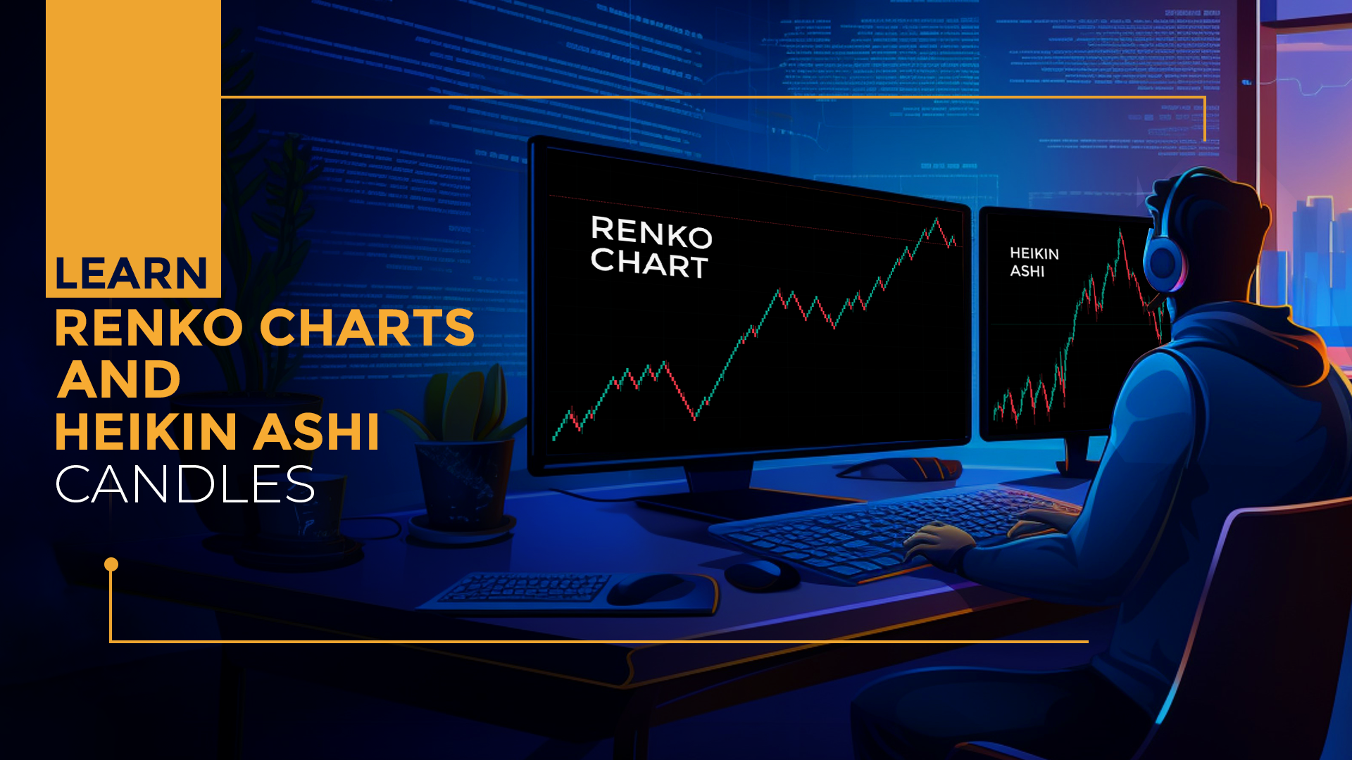
Both Renko and Heikin Ashicharts are used to spot trends, but they're a bit different. While Renko charts show bricks based on price movement, Heikin Ashi charts use a special formula to calculate the average price over time. Heikin Ashi charts help smooth out the price action and make trends more evident, but they still use time as a factor.
Renko charts are better for traders who want to focus purely on price movement, whereas Heikin Ashi charts are better for traders looking for a clearer view of the market.

Renko charts are an excellent tool for traders who want to simplify the market and focus on more significant trends. By removing the small price movements and concentrating only on the more significant trends, Renko charts help traders make more informed decisions. Whether you're a beginner or an experienced trader, learning how to use Renko charts can improve your trading strategy.

Yes, Renko charts are an tool for identifying clear market trends by focusing on price movements. This helps traders spot bullish or bearish trends more easily, leading to informed decisions.
Absolutely! They break down price movements in a way that's easy to understand, allowing you to spot robust trends with ease.
Renko charts are a versatile tool that can effectively be utilized across various timeframes. However, they truly shine for longer-term traders, offering insights that can lead to strategic advantages.
Renko charts illuminate the path to long-term trends, guiding visionaries toward enduring success, while candlestick charts empower quick decision-making, enabling savvy traders to seize fleeting opportunities.